Do fonts speak?
Do fonts convey a message without the necessity of words?
Can fonts define an era?
Is it possible for fonts to set a mood?
Do fonts have personality?
The answer is yes and more to all of the above. Additionally, typefaces and fonts can serve as an iconic identity for a large company or even an entire nation.
Think about the fonts used to define Coke, Walmart, GM, or Martha Stewart. The fonts for these and other corporations are uniform throughout buildings, advertising, publications, and letterheads, presenting a uniform and consistent identity to far flung assets and personnel. The fonts can so much define the company that when a total organizational remake is in order, logos and fonts are changed giving a whole new look and feel to the firm.
Is it reaching to say that a font can define a country? Pull out your purse or wallet and look at your United States Currency. Notice the uniformity in font usage from denomination to denomination. It is a definition of our country’s legal tender. Even to an untrained eye, any variation would likely scream Counterfeit!
Fonts can actually be quite moody and are not limited to print. They can be happy as in the titles of Merrie Melodies cartoons or they can be authoritative as in a “stop” sign. Even the Greeks had bold uniform chiseled inscriptions on ancient temples.
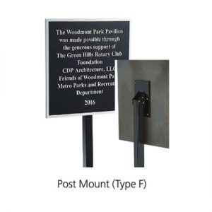
Atlas Signs and Plaques utilizes fonts that fit the intended placement and intent of our creations. Fonts used on a plaque often define an era. A Frank Lloyd Wright designed font can, as an example, appropriately enhance an Arts and Crafts style building effectively bringing continuity to the design concept and providing the finishing touch. To contrast, it would most likely be inappropriate to use a casual happy font such as Draculon on a serious memorial plaque.
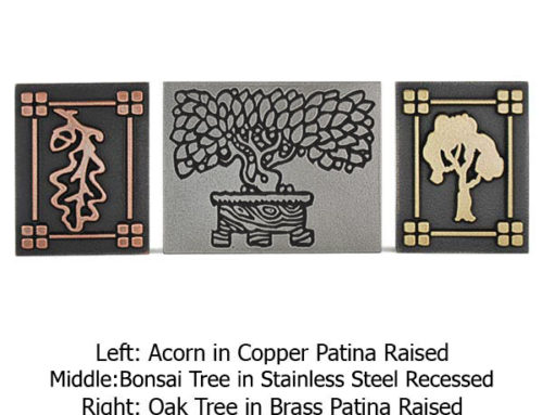
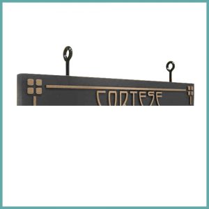
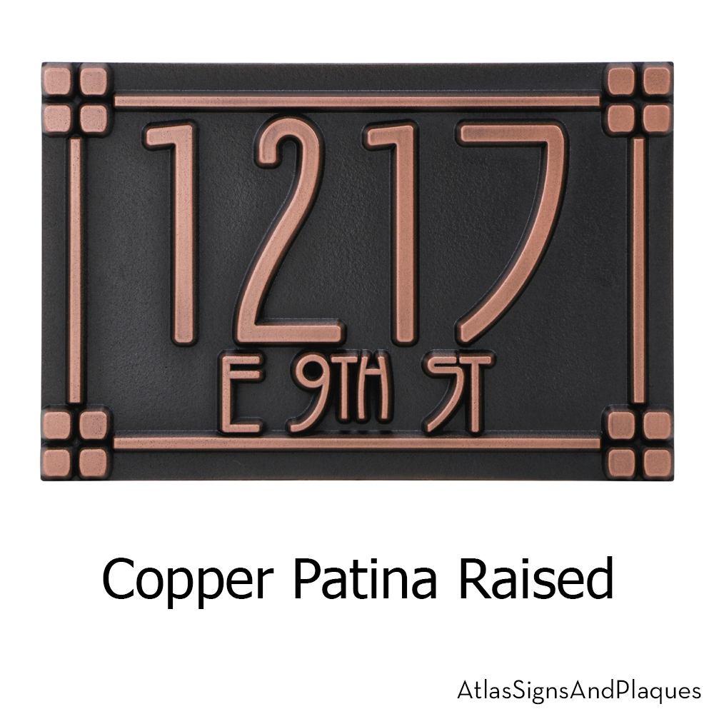
Plaques designed to compliment the Arts and Crafts Movement have become a significant part of our Address Plaque business. We think it is because we offer some of the most authentic and original fonts befitting a new build or renovation. The Rennie Mackintosh Font used in our Stickley Plaques was designed to honor the designer, Charles Rennie Mackintosh’s hand lettering style from the early part of the last century. We think it is a perfect fit.
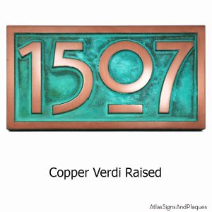
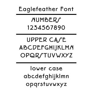
Not many can set the mood while defining the era better than The Master, Frank Lloyd Wright. He designed the Eaglerock project in the 1920s. And although never started, the lettering for the venture became the Eaglefeather font. Our
Eaglefeather Plaques revolves around this terrific Arts and Crafts font.
One of our favorites is the Footlight font. So much so that we combined some of the most popular signs and plaques that we have ever created into our Footlight Collection. The typeface, designed in 1985 has been described as “theatrical”. And the name itself comes from the footlights used in stage productions. It has a slightly hand-drawn feel, and has been labeled as “authoritative, lively, and elegant”. Used on everything from “No Solicitor” signs to Historical Plaques, it accomplishes its duties with grace, authority, and legibility. This typeface is among the most versatile, and is seldom inappropriate.
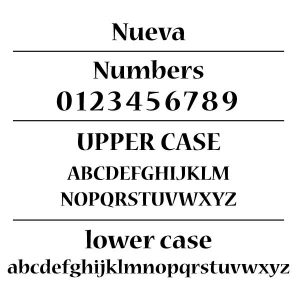
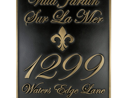
We have recently introduced the use of the Nueva font. The typeface which has an interesting, older, almost calligraphic look, was not designed until 1994 by Carol Twombly. We think Nueva (translated as “New”) fits extremely well with Dedication, Memorial, and Religious Plaques and Signage.
Our Stanton series of plaques showcases the Mona Lisa typeface font which is a 1990s adaptation of a 1930 design. The strongly contrasting thin and thick letter strokes imparts a look that is both strong and elegant. The Stanton Marker Plaque’s distinctive shape fits Historical Markers, Historic Renovations, or Designated Districts.
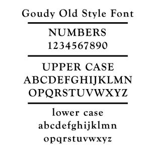
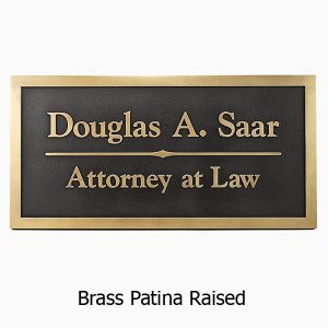
Another recent addition is our use of the Goudy font. Dating from 1916, and rooted in the Arts and Crafts Movement, this Frederic W. Goudy design retains a contemporary look that is pleasing readers almost 100 years after its inception. The font is very well balanced and the minor curvature is quite graceful with a bit of a calligraphic look. So readable, it has been used in Harpers Magazine for decades. It has a distinctive yet dignified personality making it a strong contender for use on a business sign. Not too flamboyant for a serious entity and not too stodgy for a growing company.
These examples are but a few of the many font styles that can impart your signage project with the image that you desire. Your font choice can be made primarily for easy readability or can convey a much more complex message to viewers.
The method and materials utilized by Atlas Signs and Plaques to create your order allow for an abundance of choices in font styles and size. When you really desire custom, Atlas Signs and Plaques delivers without the limitations of traditional foundry cast plaques. And, at a fraction of the cost.
