Understanding Readability Distance for Signs and Plaques: A Practical Guide
When designing or choosing a sign or plaque, one of the most critical factors to consider is readability—how far away can someone be and still comfortably read the information? Whether it’s a historical plaque, an address sign, or a commemorative marker, ensuring your text is legible from the intended distance can make or break its effectiveness. In this guide, we’ll dive into the science and practical rules behind determining the readability distance for different types of signs and plaques.
The Basics of Readability Distance
Readability distance refers to how far a person can stand and still clearly read the text on a sign. Several factors influence this distance, including:
Font Size: The height of the letters is one of the most crucial elements.
Contrast: High contrast between the text and the background (e.g., black text on a light background) enhances readability.
Lighting: Natural light, shadows, and artificial lighting play significant roles in how easily the text can be read.
Type of Font: Simple, sans-serif fonts tend to be more legible from a distance than intricate serif fonts or cursive styles.
Viewer’s Eyesight: Not everyone has perfect 20/20 vision, so allowances should be made for less-than-ideal eyesight.
Viewing Angle: When a person is not directly in front of the sign, readability diminishes.
Font Size and Readability

goudy address plaque
One rule of thumb is that each inch of letter height allows for approximately 10 feet of readability. Let’s break this down:
1-inch tall letters: Readable from up to 10 feet away.
2-inch tall letters: Readable from 20 feet away.
4-inch tall letters: Readable from 40 feet away.
For plaques, especially those installed close to eye level and meant for close-up viewing, letter sizes can be smaller. For example, a historical plaque with 0.25-inch high lowercase letters, as in the example shared earlier, is readable from approximately 2.5 feet away. However, plaques intended for reading from a greater distance—such as those on buildings or high walls—will need larger letters to be effective.
Historical Plaques and Readability
Historical plaques are usually designed for close-up viewing, where visitors can take their time to read the details. Typically, these plaques are installed on stands or walls where people can walk right up to them. In these cases, letter heights ranging from 0.25 inches to 0.75 inches are common, offering readability from 2.5 to 7.5 feet. These plaques often include more detailed information and can afford smaller fonts since viewers are expected to be in close proximity.
Address Signs and Plaques
Address signs are different—they need to be legible from a distance, often by drivers or passersby. Address numbers should be large enough to be easily visible from the street. For residential address plaques, the numbers are generally 4 inches tall, which makes them readable from about 40 feet away. If the house is set far back from the street, 6-inch or 8-inch numbers might be necessary to maintain clear readability from 60-80 feet away.
Here are some basic guidelines for address signs:
4-inch tall numbers: Ideal for homes close to the street (30-40 feet).
6-inch tall numbers: For homes set back 60-70 feet from the road.
8-inch or larger numbers: Necessary for homes with significant setbacks (80 feet or more).
It’s not just about numbers, though. If the sign includes the street name or any additional information, these details should be in a font size that complements the primary address numbers. For instance, smaller text for the street name can be 2-3 inches tall since the focus should be on the address number.
Materials and Contrast: The Hidden Factors of Readability
The materials used for your sign or plaque play a significant role in readability. High-contrast materials (such as black text on a white background or vice versa) are much easier to read than low-contrast combinations (e.g., light gray text on a cream background). This is especially important for outdoor signs that may be viewed in varying lighting conditions throughout the day.
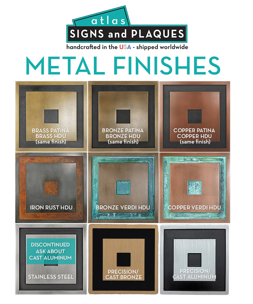
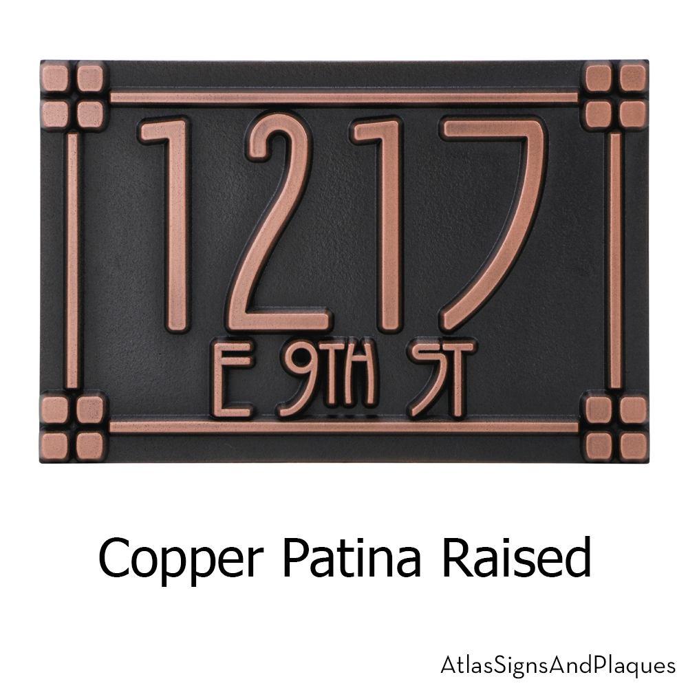
For example, bronze plaques with raised letters against a dark patina background offer excellent contrast and durability, making them popular for commemorative or address plaques. Metal-coated HDU signs (High-Density Urethane) also provide long-lasting durability with customizable finishes that enhance readability.
Sign Placement and Viewing Angles
It’s essential to think about the placement of your sign or plaque. If a sign is mounted high on a building or angled upward, the readability will decrease as people have to tilt their heads or view it from an angle. Similarly, a plaque that’s placed too low might be missed entirely if it’s not within the natural line of sight.
A well-placed address sign should be at eye level or slightly above for pedestrians and low enough for easy visibility from the road for drivers. For plaques that are installed on walls or monuments, make sure they’re tilted or positioned to face viewers directly at a comfortable reading angle.
Additional Considerations: Indoor vs. Outdoor Signs
When designing plaques or signs for indoor use, such as office door plaques or commemorative plaques in lobbies, readability distances can afford to be shorter. Fonts as small as 0.25 inches can be used since viewers are often just a few feet away. In outdoor settings, however, where lighting conditions can change, larger fonts and more durable materials are necessary to ensure readability over greater distances.
Conclusion
Whether you’re designing a historical plaque for close-up reading or an address sign meant to be seen from the street, paying attention to font size, contrast, and placement will ensure your sign serves its intended purpose. As a general rule:
Plaques: Focus on readability for close-up viewing (smaller fonts, typically 0.25 to 1 inch tall).
Address signs: Use larger numbers (4 inches or more) depending on the viewing distance from the street.
Contrast and materials: Opt for high-contrast text and durable materials that stand up to weather and lighting conditions.
With these guidelines in mind, you’ll be well on your way to creating a sign or plaque that’s both functional and aesthetically pleasing. Make sure your message can be read clearly, whether it’s standing a few feet or several yards away!
